
Happy Holidays gang! We’re back with another film stock review — LomoChrome Metropolis! I figured since we were approaching the last we days of summer (during late August) I’d rip the bandaid off and finally test this experimental film from Lomography.
The look of LomoChrome Metropolis is extremely interesting. It gives a major desaturated look to your images. I love the gritty look that this film produces in various scenarios. When I first researched this film, I saw nothing but street photography examples. That seems to be where most photographers feel this film shines. So, I went a different route when shooting my rolls.
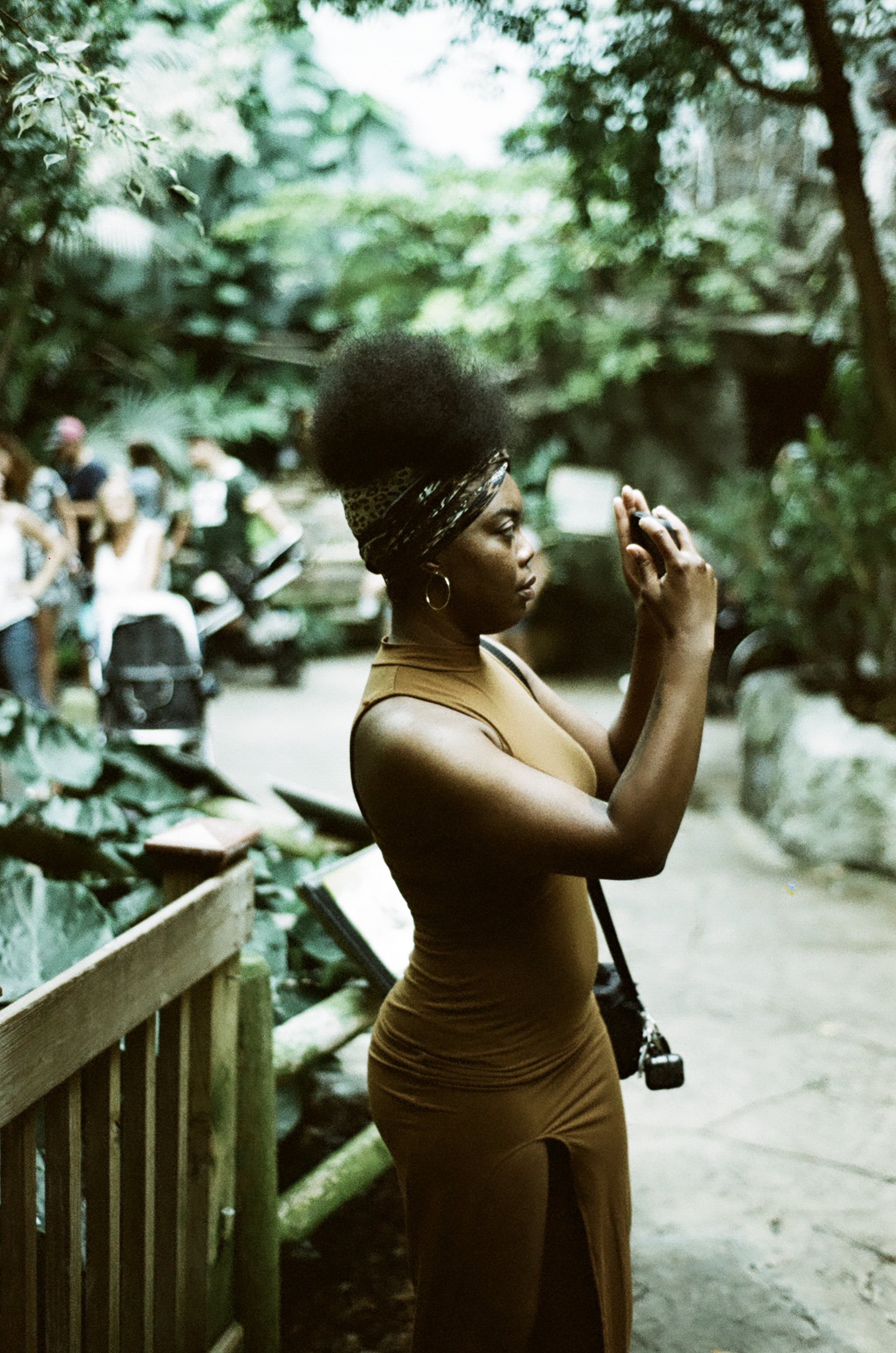
I really wanted to see what the film could do in colorful areas. What type of images could I produce with this desaturated film? In August I went to the zoo with Keya and my Nikon f3, on a bright sunny day to test out Metropolis on the 35mm format. With this film being variable iso (between 100 - 400), I decided to shoot it at 400. The results under harsh sunlight at EI 400 gave me much more desaturated images which proved to be a very interesting look.
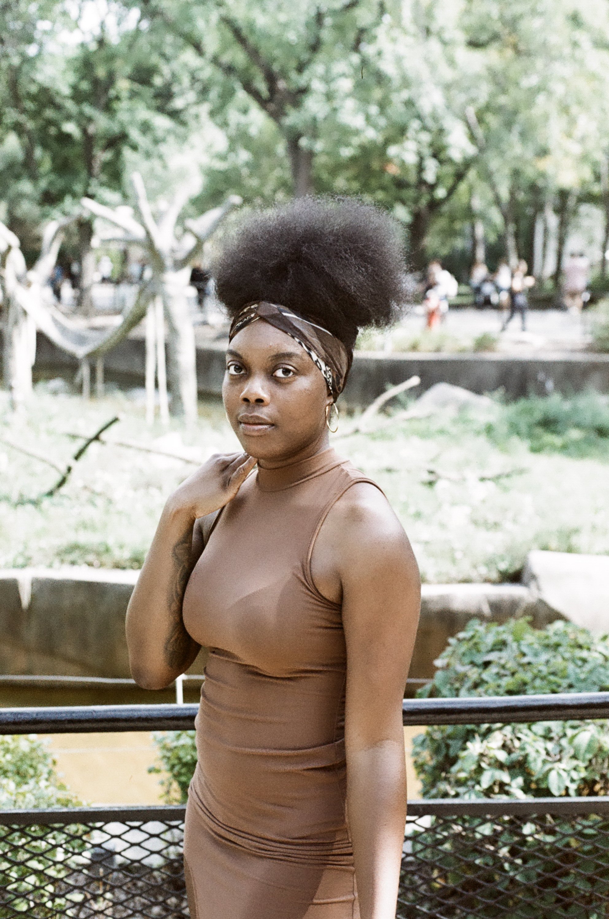
LomoChrome Metropolis | Nikon F3 | ISO 400

LomoChrome Metropolis | Nikon F3 | ISO 400

LomoChrome Metropolis | Nikon F3 | ISO 400
One of the biggest takeaways that I noticed was how deep the greens are with this film stock. They look really good. I am also a big fan of the of how the muted tones look with brown skin. Lomography also highlighted that reds stand out on this film and I found that to be 100% correct. They weren’t as bright as expected, but reds did stand out from the muted tones of the Metropolis film.

LomoChrome Metropolis | Nikon F3 | ISO 400

LomoChrome Metropolis | Nikon F3 | ISO 400
LomoChrome Metropolis | Nikon F3 | ISO 400
Because of the size of the 35mm format, the grain is very prominent. Personally, I love the grain look but it definitely depends on preference. I also thought that Metropolis has a cine film look to it, so the grain on the film accentuated this. But, as we jump into medium format later in the article, you’ll be able to see how the results differ with less grain.
In addition to the grain, Metropolis has a good amount of contrast, with the shadows going quite dark. However, the highlights hold up well, keeping plenty of detail even on 35mm.

LomoChrome Metropolis | Nikon F3 | ISO 400

LomoChrome Metropolis | Nikon F3 | ISO 400
Next we are going to dive into LomoChrome Metropolis for medium format. I was in a studio recently with my Mamiya RZ67 Pro II and decided to rate this variable iso film at 200 since I shot at 400 with the 35mm. There were a few key noticeable differences I could see right away after these photos were developed.
1). The grain wasn’t as prominent on 120 as it was on this film for 35mm. Of course that probably has to do with the format size/quality.
2). When shooting at ISO 200, I found that most images were a tad over-exposed. But this look combined with the “cine-feel” I mentioned earlier that this film produces, made for some really interesting portraits.

LomoChrome Metropolis | Mamiya RZ67 Pro II | ISO 200

LomoChrome Metropolis | Mamiya RZ67 Pro II | ISO 200

LomoChrome Metropolis | Mamiya RZ67 Pro II | ISO 200

LomoChrome Metropolis | Mamiya RZ67 Pro II | ISO 200

LomoChrome Metropolis | Mamiya RZ67 Pro II | ISO 200
I really wanted to show the different contrasts, and also how portraits of various skin tones and nature would look on this film. I like that Metropolis has an “aged-cinematic” look to it. Shooting this again I would try it at ISO 100 - though I fear if 200 ISO gave me some over-exposed highlights, than 100 ISO might be too much. But, it will take some adjusting to find the sweet spot for this film. Thanks for reading and let me know in the comments your thoughts on Lomochrome Metropolis!